Complementary colors, the ratio determines everything!
In "On Color Science: Humanistic HSB Color Space," we described that color consists of three "hues," "lightness," and "saturation," and we know that "hue" is The attributes that people understand when they first understand color are the names of the so-called colors, such as red, yellow, blue...etc. The following are the most common 12-hue circles:
In the composition of the hue circle, the colors that are 180 degrees apart are called complementary colors: red and green are complementary, yellow and purple are complementary, and blue and orange are complementary.
Due to the strong separation of complementary colors, the use of complementary color matching design can effectively enhance the contrast of the overall color matching and the sense of distance, and it can also exhibit special visual contrast and balance effects. Feeling lively and full of vitality.
Of course, if the conditions of the colors are slightly relaxed, for example, the adjacent colors of the 180-degree complementary colors are also taken into consideration, the color colors that can be formed are wider and more abundant.

Complementary colors, the ratio determines everything!
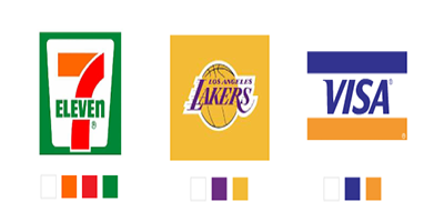
Since the contrast between the complementary colors is quite strong, in order to properly use the complementary colors, the ratio of colors to each other must be carefully considered. Therefore, when using a complementary color match, it is necessary to use a large area of one color and another small area of complementary color to achieve balance. If the proportion of the two colors is the same, the contrast will appear too strong. For example, if red and green occupy the same area on the screen, it is easy to make people feel dizzy. One of the colors may be selected to be a large area, constituting a main color, and the other color is a small area as a contrasting color. Experience will be based on the ratio of 3:7 or even 2:8.

Japanese designers have proposed color proportioning principles of 75%, 25%, and 5% for color matching, where the background color is the background color for large areas, and the dominant color and accent color are complementary. The characteristics of color, in terms of main colors and accent colors are all set off.
However, if the use of three-color matching methods is not sufficient, まりっぺ also believes that cutting must be done from the existing color distribution to avoid affecting the overall color matching ratio (see the author's website for more details).
There are infinitely many color matching methods available in the world. This is only one of many color matching techniques used. Friends who are interested do not imitate the color scheme of some design works in daily life, or refer to color-related websites such as 3nhglobal. Perhaps they can find more different colors. Color matching method.